Create spaces that look beautiful—and feel balanced.
When it comes to interior design, colours are far more than just visual delight. They influence our emotions, energy levels, and even the harmony within our homes and workplaces. At Design Insignia, we believe in crafting spaces where modern aesthetics and traditional wisdom coexist seamlessly. This is where Vastu Shastra meets contemporary colour design.
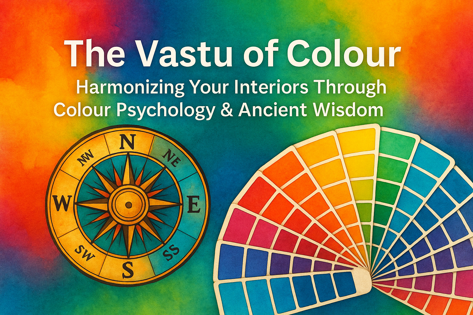
Why Vastu Shastra & Colour Are Interconnected
Vastu Shastra, the ancient Indian science of architecture and spatial energy, offers insights into how colours affect the flow of energy—or prana—through our interiors. It associates each direction in a home or building with specific elements and colours.
While modern trends might lean towards stark neutrals or bold contrasts, integrating Vastu-compliant colours ensures your space is stylish, harmonious, and energetically balanced.
Vastu Colour Guide for Interiors
North (Water Element)
- Colours: Blue, green, silver
- Ideal For: Living rooms, studies, cash counters
- Benefits: Encourages calmness, prosperity, and mental clarity
South (Fire Element)
- Colours: Red, orange, coral, deep pink
- Ideal For: Kitchens, workout areas
- Benefits: Adds energy, warmth, and passion (use in moderation)
East (Air Element)
- Colours: White, light blue, green
- Ideal For: Puja rooms, balconies, meditation zones
- Benefits: Promotes growth, vitality, and spiritual peace
West (Earth/Space Element)
- Colours: Grey, silver, beige
- Ideal For: Dining rooms, children’s bedrooms
- Benefits: Brings stability and balance
Northeast (Ishaan Kona)
- Colours: Light yellow, white, pale blue
- Ideal For: Prayer or study rooms
- Benefits: Creates a sacred, peaceful environment
Southwest (Nairutya Kona)
- Colours: Browns, taupe, mustard
- Ideal For: Master bedrooms, family spaces
- Benefits: Encourages restful sleep, strong family bonds, and stability
Pro Tips from Design Insignia
✅ Balance is Key: Avoid overusing strong shades like red or black. Use them as accents rather than dominant shades.
✅ Function Guides Colour: For instance, a southeast kitchen benefits from warm reds or terracotta, while a southwest bedroom flourishes with earthy neutrals.
✅ Personal Taste Matters: While Vastu offers valuable guidance, your comfort and unique style matter most. We help you blend both beautifully.
Why Colour & Vastu Matter
Whether designing a luxurious villa or a cozy urban apartment, colours deeply affect how your space feels and functions. At Design Insignia, we blend traditional wisdom with modern aesthetics to create interiors that are not only beautiful—but balanced and energetically aligned.
Let’s Colour Your World—Mindfully!
Ready to transform your home or workspace? Connect with Design Insignia, and let’s craft interiors where energy flows freely and your story shines through every hue.
📞 Contact us today to start your journey toward Vastu-aligned design.
 Velvet Teal Blue
1 × $195
Velvet Teal Blue
1 × $195